
Education1 month ago
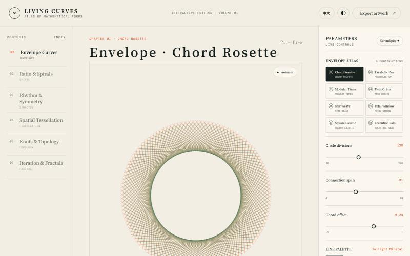
Atlas of Living Curves
Explore interactive visualizations of mathematical curves, fractals, symmetry, and topology.

@vkuoo · X
Added more demos showcasing graph-math relationships, built with Codex.
The full gallery
Tech stack
60 projects
Explore interactive visualizations of mathematical curves, fractals, symmetry, and topology.
@vkuoo · X
Added more demos showcasing graph-math relationships, built with Codex.
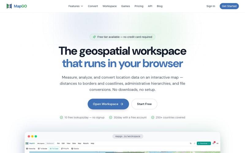
Analyze and visualize geospatial data, calculate distances, and process bulk CSV files with online GIS mapping tools.

@JanasSebastian · X

Real-time 3D visualization of crypto market data using live exchange data and cinematic post-processing.

@zacxbt · X
my current apps: • j******** (redacted) • @irigenerative (my first nft) • non-crypto saas app • penis game • blockrunner (my endless runner iOS app posted a vid a week ago) • petwidge (per iOS app) • nftwidge (nft gallery iOS app) • (pretty charts) • @perpspet (3d gamified perps) • (gamified bridge) • crypto twitter social app (don’t want to spoil the details) • portfolio pet game where the character is your portfolio, you feed him coins and he grows/evolves • (first app i ever vibe coded in dec) • onchain jam (nba jam 2v2 game but each team is a chain ex: base team = brian + jesse) • waffle world (3d waffle platformer lol) - 3d social trenches game
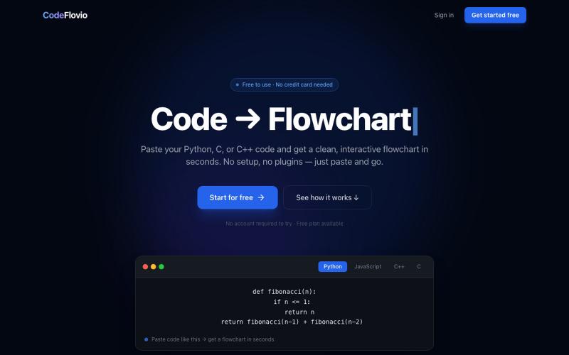
Convert code into interactive flowcharts for learning, debugging, and documentation.

@Sparsh209 · X
Hi isha! Check it out here at: Would love to hear your feedbacks

Interactive AI audit funnel for analyzing systems with multiple visual approaches.

@jozef_x1 · X
🚨 I Vibe Coded F0ur (4) different versions of @coreyganim's "Ai Audit" Funnel, which is your favourite? VERSION #3:
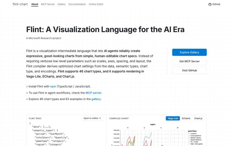
A visualization language designed for AI agents to create and interact with charts.
chenglong-hn · HN
Data visualizations are the bridge between user and data. But building AI agents that can generate visualizations reliably can be very tricky: - simple chart specs can be reliable, but generated charts are often of low quality due to reliance on system defaults; - complex chart specs with explicit details can produce good-looking charts, but they are verbose and agents can struggle with reliability We figured out it is a limitation on the language issue (not just AI capability thing) -- current visualization languages are a bit too low-level for AI agents, requiring them to explicitly make visual decisions that are supposed to be handled by a good compiler. Flint is a visualization intermediate language to address this issue, allow AI agents to solve this last-mile human-agent interaction problem. It provides a simple semantic-type based specification, and contains a layout optimization engine that can produce good-looking charts (filled with derived low-level details) from simple
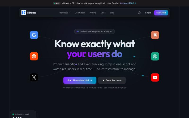
Track and analyze product user events with an interactive analytics dashboard.

@kitbasedev · X
We just launched, check us out at
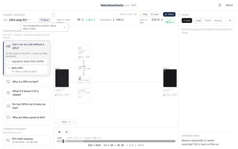
Visualize hardware performance metrics while running LLM inference on your system.
dev_dan_2 · HN
WatchMachineGo – A visualizer to show hardware performing LLM inference
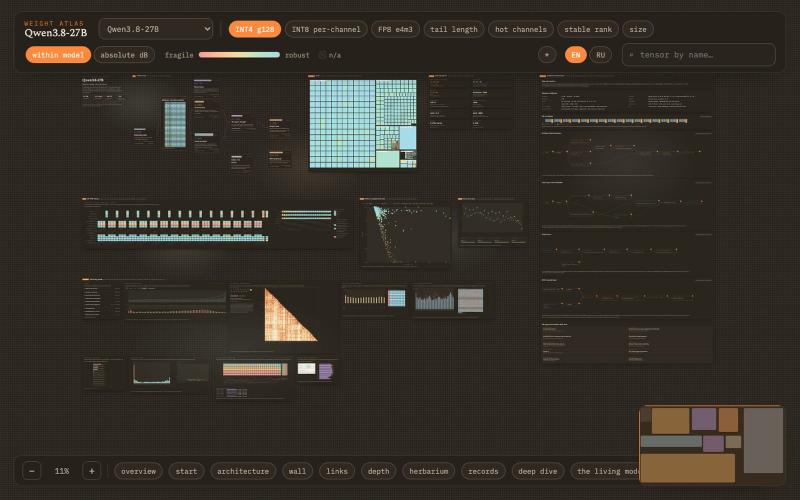
Canvas for inspecting LLM weights tensor-by-tensor with quantization error and distribution analysis.
alesha-pro · GitHub
atlas Interactive canvas for taking an LLM apart tensor by tensor: measured INT8/INT4/FP8 error, distributions, spectra and outlier channels for every weight tensor

Monitor critical business metrics in real time for your professional service firm.

@Spotchdashboard · X

Real-time visualization of BTC/ETH/SOL futures markets with long/short position battles.
flreey · V2EX
模拟 btc/eth/sol 多空军沙盘效果 https://w3arb.xyz/ 其他地方看到的创意,我觉得很有意思,模拟币圈多军/空军对战场景 底部还可以发弹幕,聊天

Monitor AI and LLM applications with token tracking, cost analysis, and latency metrics.
ephraimduncan · HN
Observability for Coding Agents and LLM Applications