

Finance & Business2 weeks ago
FlowingPulse — Stop guessing your runway. Know your pulse.
Cashflow dashboard for solopreneurs to track burn rate, taxes, and runway.

@kaki_llc · X
Check out what I just built with Lovable!
The full gallery
Tech stack
60 projects
Cashflow dashboard for solopreneurs to track burn rate, taxes, and runway.
@kaki_llc · X
Check out what I just built with Lovable!
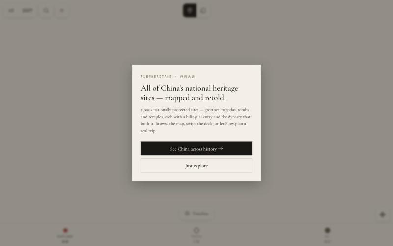
AI-powered map and trip planner for China's cultural heritage sites.

@promptingfox · X
Hot nerd vibe is swiping right ancient architecture like Tinder. I absolutely adore this vibe coding project. Explore China’s ancient heritage sites & get AI trip planning at
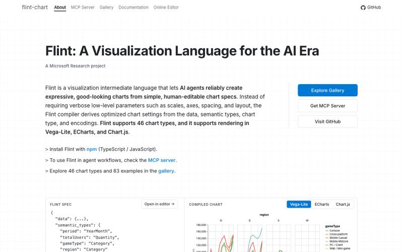
A visualization language designed for AI agents to create and interact with charts.
chenglong-hn · HN
Data visualizations are the bridge between user and data. But building AI agents that can generate visualizations reliably can be very tricky: - simple chart specs can be reliable, but generated charts are often of low quality due to reliance on system defaults; - complex chart specs with explicit details can produce good-looking charts, but they are verbose and agents can struggle with reliability We figured out it is a limitation on the language issue (not just AI capability thing) -- current visualization languages are a bit too low-level for AI agents, requiring them to explicitly make visual decisions that are supposed to be handled by a good compiler. Flint is a visualization intermediate language to address this issue, allow AI agents to solve this last-mile human-agent interaction problem. It provides a simple semantic-type based specification, and contains a layout optimization engine that can produce good-looking charts (filled with derived low-level details) from simple
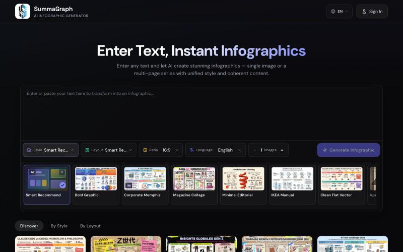
Generate infographics from text using AI with 17 visual styles and 20 layout templates.
SummaGraph — AI 信息图生成工具,粘贴任意形式的文本即可一键生成高质量信息图,内置 20 种视觉风格 × 20 种布局模板,支持系列模式一次生成多页风格连续的信息图,覆盖中英日韩等 9 种语言
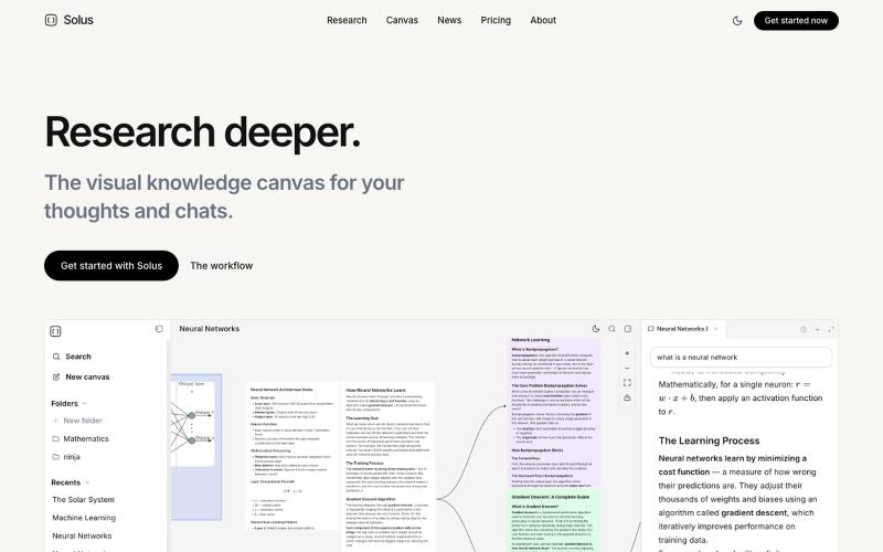
Upload PDFs and videos to build a visual knowledge map, then query an AI research assistant.
allybahaei · HN
Bring all your sources into a visual space, ask questions with full context, branch LLM conversations, and go deep on YouTube videos / research papers to build your knowledge canvas.
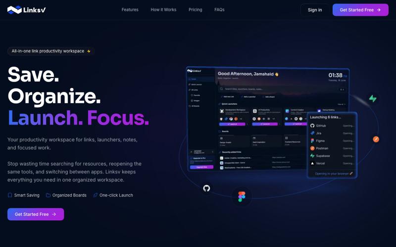
Organize your tools, workflows, and resources into one accessible workspace.

@mj_jimmi · X
Organize and share your purchased items in a visual, shareable gallery.

@michaelaplesner · X
hey :) building @trymaze_app <3 it's like Pinterest for the things you actually bought.
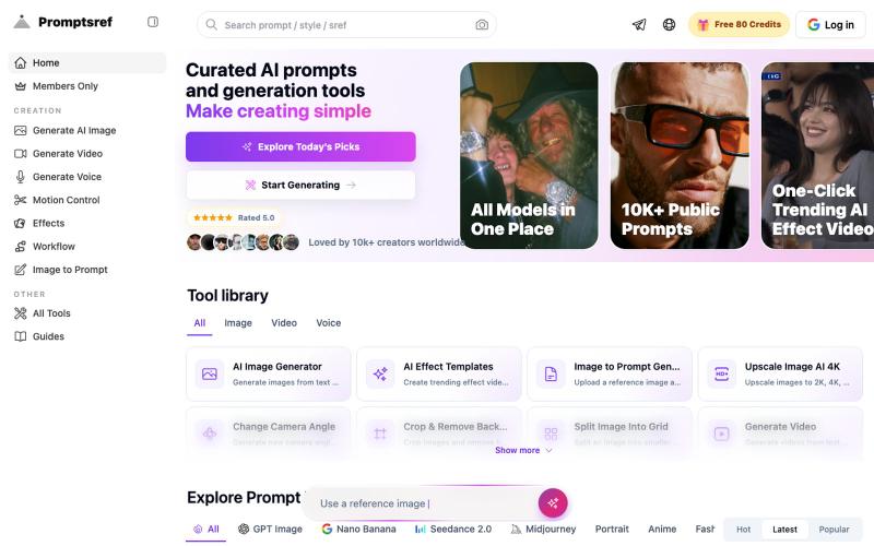
Browse curated Midjourney sref codes organized by style to generate consistent image aesthetics.
Midjourney Sref code 精选库 — 在 Midjourney 的 prompt 输入 `--sref xxx` ,可以固定生成某种特定风格的图片。这对很多人来说非常方便,不用写一堆效果词,只要记住几位数字就可以。但 `--sref xxx` 有大概 40 亿个,其中重复或者质量不佳的不在少数。因此做了一个网站把一些个人觉得不错的 sref code 收集起来并进行分类,方便新人或
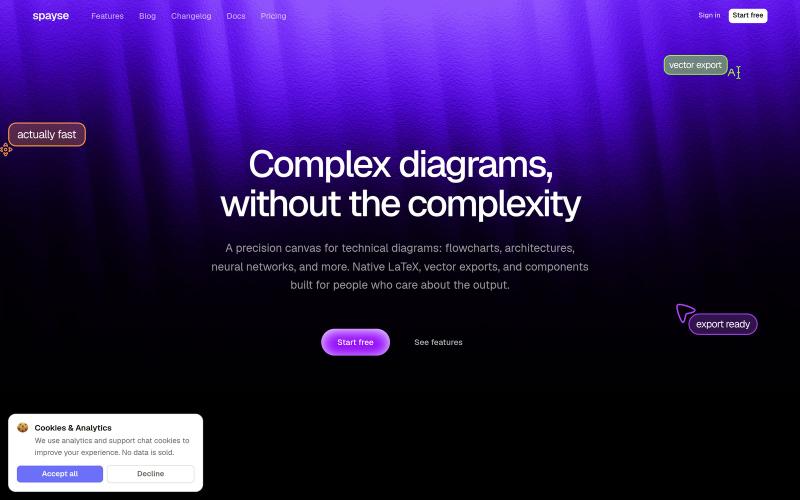
Spayse is a fast diagram canvas for flowcharts, system architecture, and technical figures. Native LaTeX, vector SVG and PDF exports.

@aakarshgoyall · X
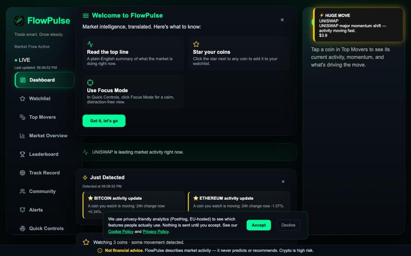
Translates real-time crypto market data into plain-English signals showing what's moving and why.
u/Horror_Office_5737 · Reddit
Finally Launching a project New market intelligence tool So today I finally published a tool I’ve been building for months. It’s a pretty simple tool. Translates market data into plain English words saving users time analysing charts. And I see a lot of AI trading bots being made right now. This is not what that is. We’ve had a few people disagree with this because “if people want to trade they should know how to read a chart” which is fair enough. But it can also be used as an education
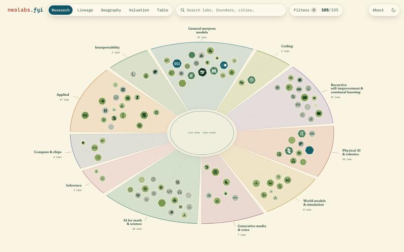
Explore an interactive map of AI labs visualized by valuation, geography, and research area.
polyphilz · HN
Neolabs.fyi – 100 new AI labs by research area, valuation, and more
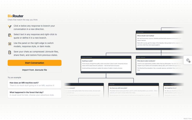
Chat with AI models and visualize conversations as branching diagrams using OpenRouter.
two-sandwich · HN
BixRouter – a non-linear AI chat interface for OpenRouter