
Other3 weeks ago
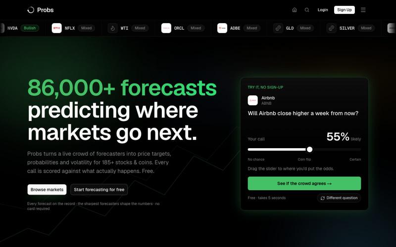
Probs · Forecast in probabilities, not opinions.
Probs doesn't tell you what to buy. It measures what the market expects, weighted by each forecaster's proven track record, and proves who's best at predicting it.

@Probsze4w · X
The full gallery
Tech stack
60 projects
Probs doesn't tell you what to buy. It measures what the market expects, weighted by each forecaster's proven track record, and proves who's best at predicting it.
@Probsze4w · X

AI-powered tool that analyzes stock chart patterns and answers trading questions on your charts.

@TideViewAI · X
观潮 TideView 上线了。 以 AI 为基座的看盘图表。你正在看的标的、周期、画线,它都读得懂。你问市场,它直接在图上回答。 免费网页即开
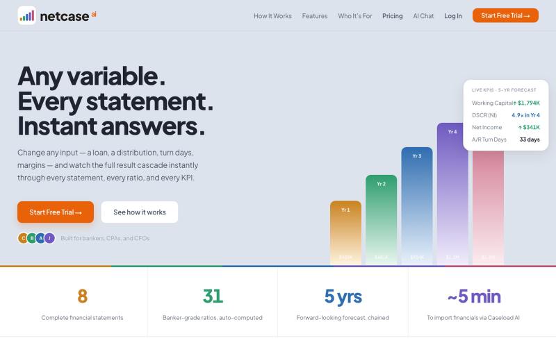
Analyze credit and forecast financial outcomes for lending decisions.

@caseyyoshi · X
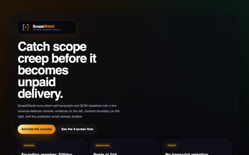
Analyzes agency meeting transcripts to detect scope creep risks and generate alerts.

@theshaunak_twit · X
ScopeShield ( A platform designed to kill scope creep for agencies and teams before it eats their margins. Built so you don’t forget scopes and stop doing unbilled work.
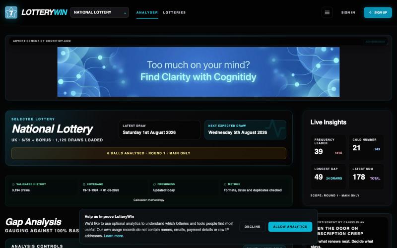
Explore worldwide lottery results, draw history, number frequencies, gaps and statistical analysis tools with LotteryWin.

@tooltilities · X
Just launched LotteryWin: Currently allows analysis of 46 lottos. A pet project of mine that's grown huge with vibe coding. #lotteryWin #lotto #BuildInPublic
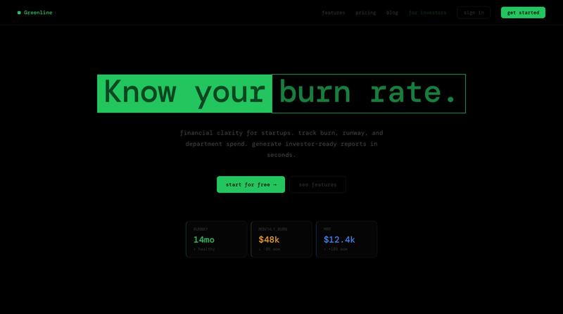
Track burn rate, runway, and department spend to generate investor-ready PDF reports.

@greenlinebudget · X
financial tool for startups:

Real-time visualization of BTC/ETH/SOL futures markets with long/short position battles.
flreey · V2EX
模拟 btc/eth/sol 多空军沙盘效果 https://w3arb.xyz/ 其他地方看到的创意,我觉得很有意思,模拟币圈多军/空军对战场景 底部还可以发弹幕,聊天
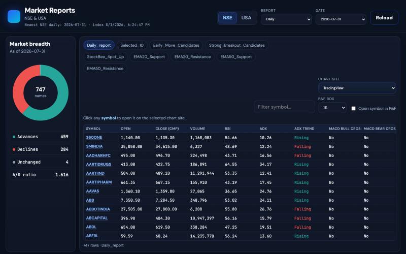
@jacobAlswin Point and figure chart US stock https://t.co/LiS8OfbhKj

@neha041187 · X
Point and figure chart US stock
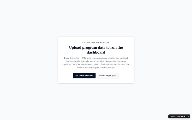
Executive overview dashboard for CDC Nigeria's HIV program showing KPIs, treatment cascade, and performance metrics.

@Spernixx · X
Check out what I just built with Lovable!
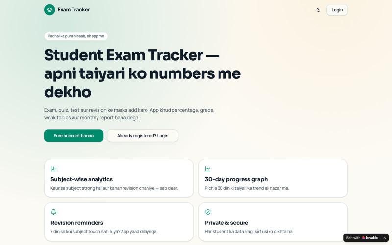
Track exam and quiz marks with automatic grade calculations, weak topic identification, and monthly reports.

@ritikk_kushwaha · X
Check out what I just built with Lovable!
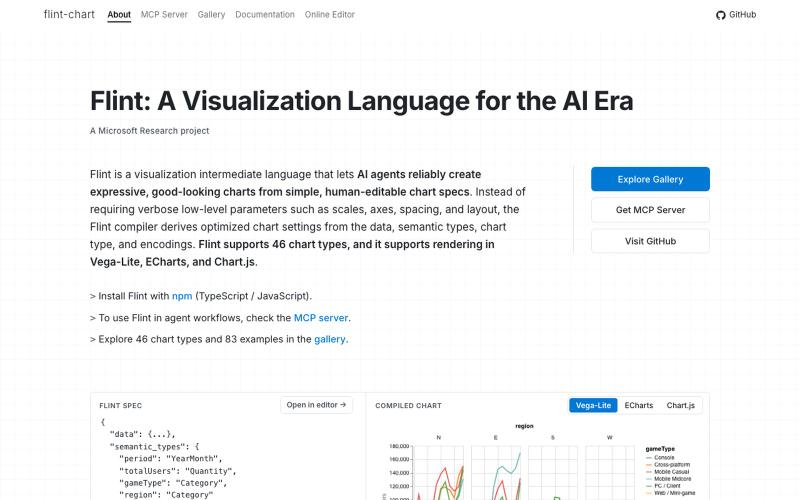
A visualization language designed for AI agents to create and interact with charts.
chenglong-hn · HN
Data visualizations are the bridge between user and data. But building AI agents that can generate visualizations reliably can be very tricky: - simple chart specs can be reliable, but generated charts are often of low quality due to reliance on system defaults; - complex chart specs with explicit details can produce good-looking charts, but they are verbose and agents can struggle with reliability We figured out it is a limitation on the language issue (not just AI capability thing) -- current visualization languages are a bit too low-level for AI agents, requiring them to explicitly make visual decisions that are supposed to be handled by a good compiler. Flint is a visualization intermediate language to address this issue, allow AI agents to solve this last-mile human-agent interaction problem. It provides a simple semantic-type based specification, and contains a layout optimization engine that can produce good-looking charts (filled with derived low-level details) from simple
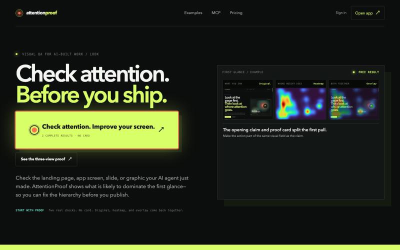
Analyze predicted human attention on designs with ML heatmaps and overlays.
u/dimabreezy · Reddit
Hey, I built a tech that predicts human attention (it's Machine Learning + Data project). I've being using it for the past 2 months and it gives amazing results to AI agents I'm a software engineer and I also love good visuals. And I hate when AI build UI but it doesn't understand what should be GRABBING the attention, so I've build a tech that solves that https://attentionproof.com/ Here you can sign in with the ChatGPT account and get free 2 tries (I got limited compute) so please g