

Other5 days ago
Spayse | Complex diagrams, without the complexity
Spayse is a fast diagram canvas for flowcharts, system architecture, and technical figures. Native LaTeX, vector SVG and PDF exports.

@aakarshgoyall · X
The full gallery
Tech stack
60 projects
Spayse is a fast diagram canvas for flowcharts, system architecture, and technical figures. Native LaTeX, vector SVG and PDF exports.
@aakarshgoyall · X
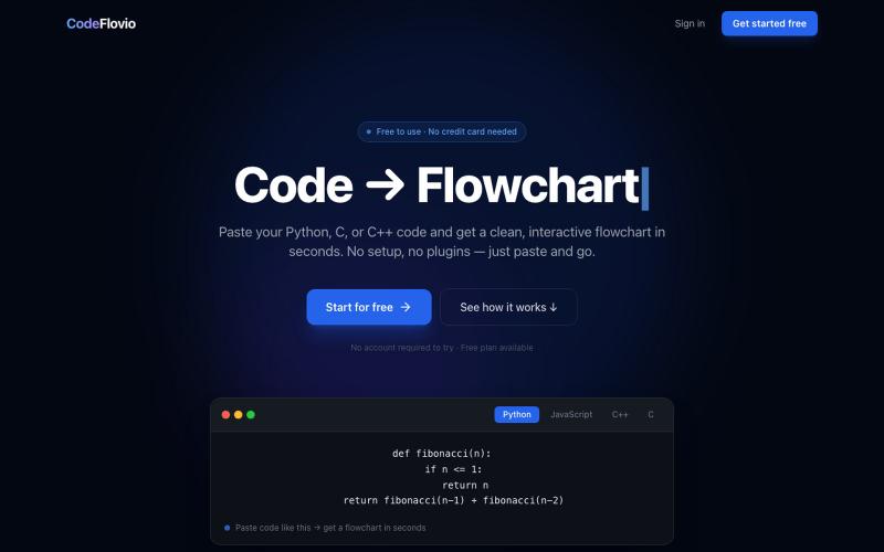
Convert code into interactive flowcharts for learning, debugging, and documentation.

@Sparsh209 · X
Hi isha! Check it out here at: Would love to hear your feedbacks

Detect AI-generated content in text and documents with per-sentence analysis and exportable reports.
Detector de IA — 西班牙语优先的 AI 文本复核网站,可检查粘贴文本和文档,查看概率信号、句子高亮和可导出报告
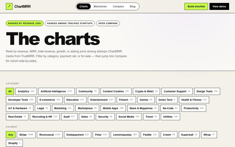
Browse verified revenue charts sorted by 30-day performance and category.

@gimafore · X
Market intelligence on verified revenue, see how much it takes to get ROI when you acquire a startup
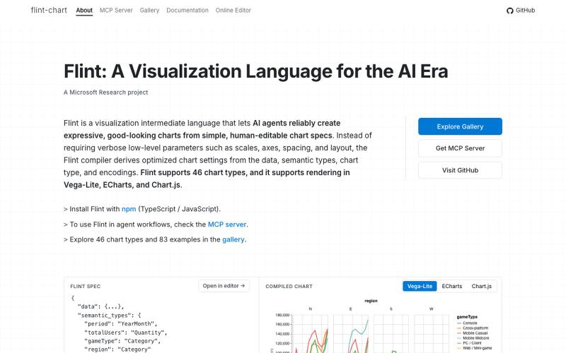
A visualization language designed for AI agents to create and interact with charts.
chenglong-hn · HN
Data visualizations are the bridge between user and data. But building AI agents that can generate visualizations reliably can be very tricky: - simple chart specs can be reliable, but generated charts are often of low quality due to reliance on system defaults; - complex chart specs with explicit details can produce good-looking charts, but they are verbose and agents can struggle with reliability We figured out it is a limitation on the language issue (not just AI capability thing) -- current visualization languages are a bit too low-level for AI agents, requiring them to explicitly make visual decisions that are supposed to be handled by a good compiler. Flint is a visualization intermediate language to address this issue, allow AI agents to solve this last-mile human-agent interaction problem. It provides a simple semantic-type based specification, and contains a layout optimization engine that can produce good-looking charts (filled with derived low-level details) from simple
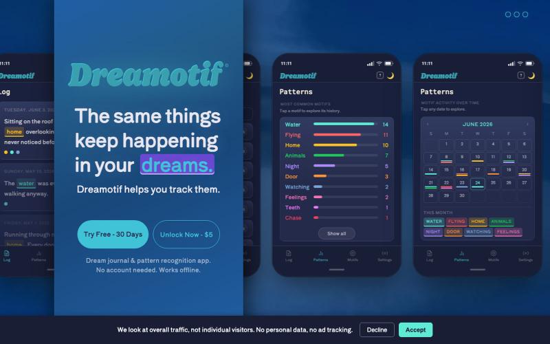
Log dreams and discover recurring patterns with color-coded charts.
u/sucsforyou · Reddit
I built Dreamotif, a private dream journal that calculates what keeps coming back. No AI. Dreamotif is a private journal that calculates the motfis - the recurring themes and elements in your dreams - the motifs. You can try it at Dreamotif.com I used to log my dreams in a Google Doc with a color-coded key at the top listing the different things that kept showing up. A blue highlight for water, for the bodies of water that used to be a very common element of mine. Brown for

View Bitcoin bottom and top-risk signals from composite technical, on-chain, and sentiment indicators.

@BDNcontent · X
Every post in my LinkedIn timeline is about one of two things right now: 1) Github is the new necessity for marketers, and 2) Substack integrated Pangram to "combat AI slop." The first one is kind of cool, I made my own Github this week to publish the first tool I vibe coded on my own. The second one is kind of annoying because while some people already know AI detectors are almost useless, some are also hailing Substack as being forward-thinking and righteous for bringing down the big bad AI sloppers. What Substack did boils down to a marketing ploy. The hot trend in advertising/marketing right now is being anti-AI because a lot of people are sick of AI slop, understandably. But Pangram isn't a fix for anything other than the most generic one-prompt outputs, i.e., someone goes to ChatGPT and says "write me a long-form newsletter," and they copy + paste the output. That will obviously be flagged. If someone has a custom project or GPT they trained extensively,
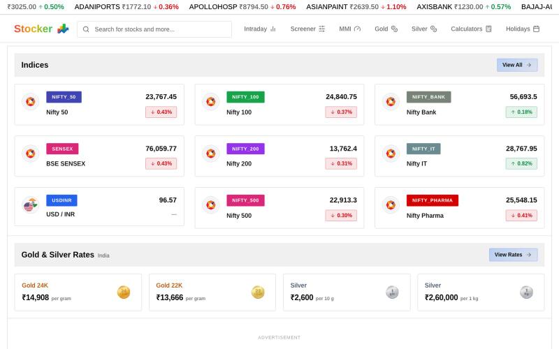
Track real-time Indian stock prices, charts, and market analysis on NSE and BSE exchanges.

@SammedChougule · X
✨ What's New in Stocker? Just shipped a major update to Stocker. This release is all about one thing: Cleaner UI. Faster insights. Better investing experience. Here's what's new 👇 #Buildinpublic #FinTech #Stocker #Softwareengineer #StockMarket

Track live gold prices with technical analysis, key support/resistance levels, and trend indicators.

@DataVoxy · X
Just shipped: a live gold market dashboard that auto-updates every 15 min. Built with Python + Cloudflare Workers + R2. Zero cost to run. More tools coming. Building in public.

Build an AI-designed profile website with business cards and per-visitor analytics.

@niazjz · X
15 years of better *ways* to share your card. Nobody built *intelligence* around the exchange. We did. Auto-generated website + per-visitor heatmaps + session replay. Every scan becomes actionable data.
Free online tool for creating flowcharts, process diagrams, org charts, and UML diagrams.

@N0V4Dev · X
I found a tool called Next AI that links AI capabilities directly with diagrams. It lets you build and edit diagrams using natural language prompts instead of clicking around the canvas manually. It's a handy way to sketch out architecture when you don't want to drag every box yourself. The project is built on TypeScript with React 19 and Next.js. It supports multiple AI providers and even includes an MCP Server. This means you can use it with the Claude Code CLI to generate diagrams from your terminal. Deployment options are flexible too. You can run the tool locally with Docker or push it to Vercel and Cloudflare Workers. It supports multi provider setups so you can pick the backend that fits your workflow. #Nextjs #AI #Diagrams #TypeScript
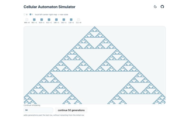
Interactive explorer for scanning cellular automata rules and visualizing their evolution patterns.
kypaku · HN
Scanner for cellular automata rule space