
教育学习7 hours ago
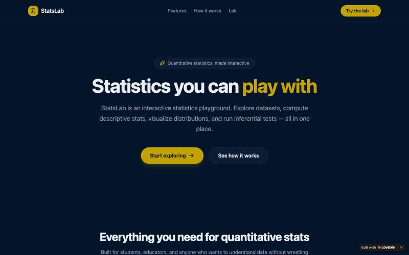
StatsLab — Interactive Statistics Playground
探索数据集、计算统计数据、可视化分布和进行推断检验。

@DaytonaRaised · X
Check out what I just built with Lovable!
完整作品展
技术栈
60 projects
探索数据集、计算统计数据、可视化分布和进行推断检验。
@DaytonaRaised · X
Check out what I just built with Lovable!

LSBattle实时展示BTC/ETH/SOL期货市场多空战场可视化。
flreey · V2EX
模拟 btc/eth/sol 多空军沙盘效果 https://w3arb.xyz/ 其他地方看到的创意,我觉得很有意思,模拟币圈多军/空军对战场景 底部还可以发弹幕,聊天

charts.art 用实时交易所数据呈现的 3D 加密货币市场可视化。

@zacxbt · X
my current apps: • j******** (redacted) • @irigenerative (my first nft) • non-crypto saas app • penis game • blockrunner (my endless runner iOS app posted a vid a week ago) • petwidge (per iOS app) • nftwidge (nft gallery iOS app) • (pretty charts) • @perpspet (3d gamified perps) • (gamified bridge) • crypto twitter social app (don’t want to spoil the details) • portfolio pet game where the character is your portfolio, you feed him coins and he grows/evolves • (first app i ever vibe coded in dec) • onchain jam (nba jam 2v2 game but each team is a chain ex: base team = brian + jesse) • waffle world (3d waffle platformer lol) - 3d social trenches game
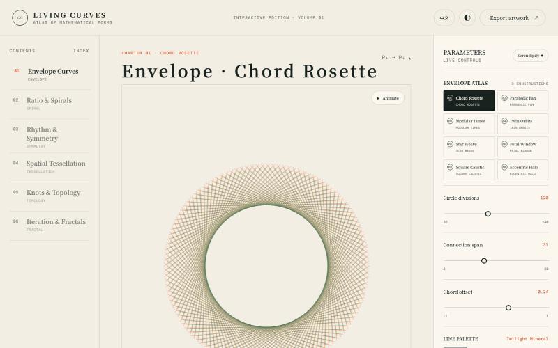
探索数学曲线、分形、对称和拓扑的交互式可视化。

@vkuoo · X
Added more demos showcasing graph-math relationships, built with Codex.
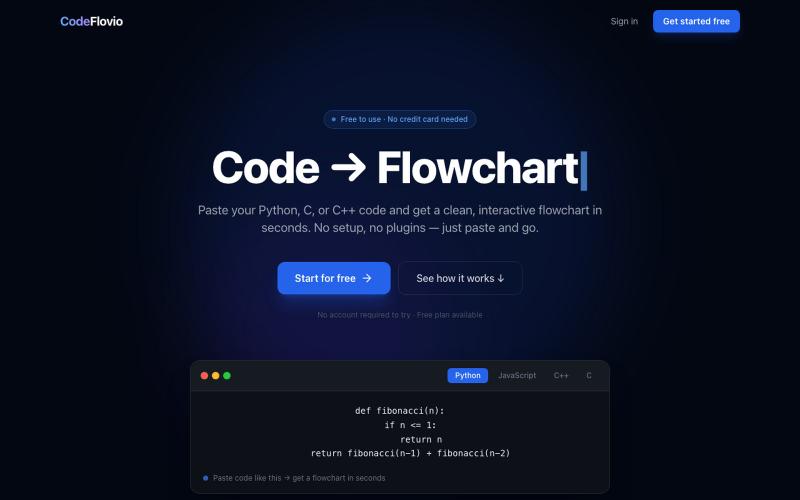
CodeFlovio 将代码转换为交互式流程图,便于学习、调试和文档编制。

@Sparsh209 · X
Hi isha! Check it out here at: Would love to hear your feedbacks
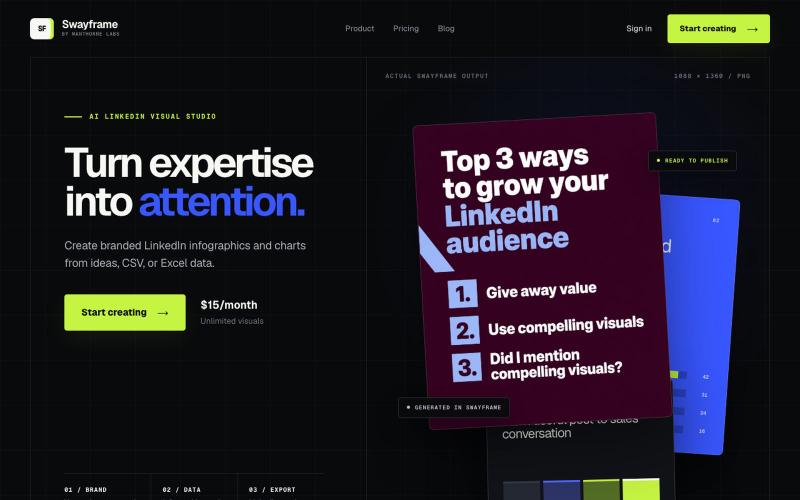
从想法、CSV或Excel数据生成LinkedIn信息图和图表。

@manthornelabs · X
We make LinkedIn graphics for B2B founders
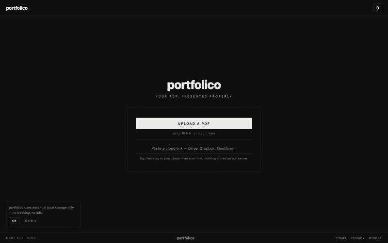
将PDF作品集转为portfolico交互式在线展示,多种浏览模式可选。

@il_deil · X
I’m building an interactive, ultra-minimalist portfolio platform strictly for architects & designers, because I tired of ads and clutter ruining portfolio on Issuu and same services. I made zero visual noise. Multiple viewing modes. Just your portfolio
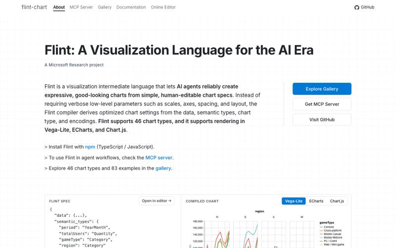
Flint是为AI代理设计的可视化语言,用于创建交互式数据可视化。
chenglong-hn · HN
Data visualizations are the bridge between user and data. But building AI agents that can generate visualizations reliably can be very tricky: - simple chart specs can be reliable, but generated charts are often of low quality due to reliance on system defaults; - complex chart specs with explicit details can produce good-looking charts, but they are verbose and agents can struggle with reliability We figured out it is a limitation on the language issue (not just AI capability thing) -- current visualization languages are a bit too low-level for AI agents, requiring them to explicitly make visual decisions that are supposed to be handled by a good compiler. Flint is a visualization intermediate language to address this issue, allow AI agents to solve this last-mile human-agent interaction problem. It provides a simple semantic-type based specification, and contains a layout optimization engine that can produce good-looking charts (filled with derived low-level details) from simple
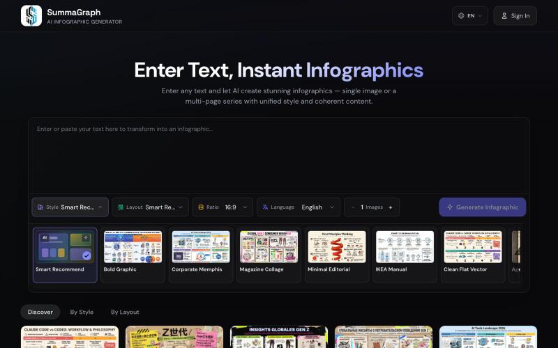
Summagraph 用 AI 将文本转换为信息图,提供 17 种风格和 20 种布局选择。
SummaGraph — AI 信息图生成工具,粘贴任意形式的文本即可一键生成高质量信息图,内置 20 种视觉风格 × 20 种布局模板,支持系列模式一次生成多页风格连续的信息图,覆盖中英日韩等 9 种语言
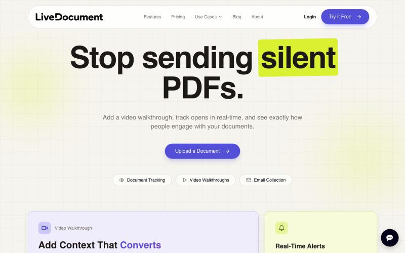
在 PDF 文档中嵌入视频,跟踪观众参与度和分析数据。

@Cam_james05 · X
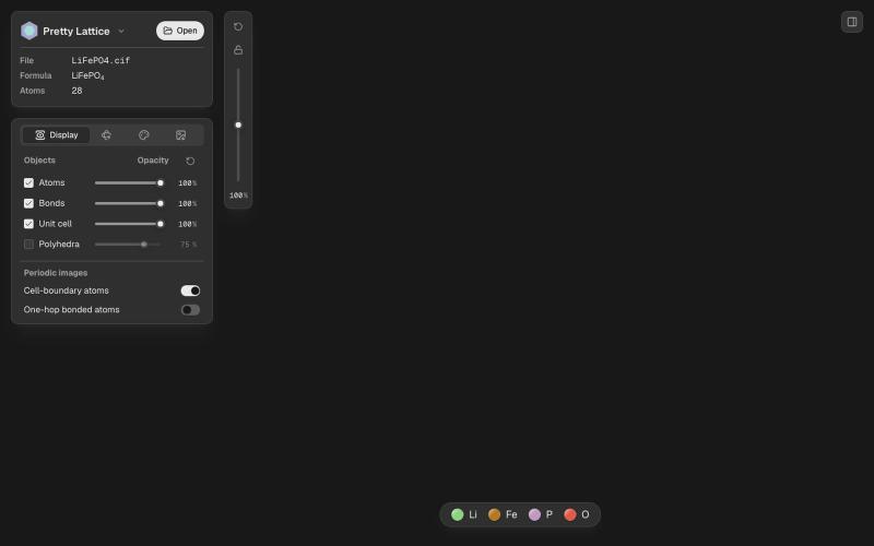
创建美丽的晶体可视化和图案。

@songfeitong · X
Introducing Pretty Lattice, a modern-looking crystal visualization tool for creating beautiful figures. Built with Codex since 5.5, and now with 5.6 sol. A huge leap from 5.5, much better at frond end. Github: Demo:
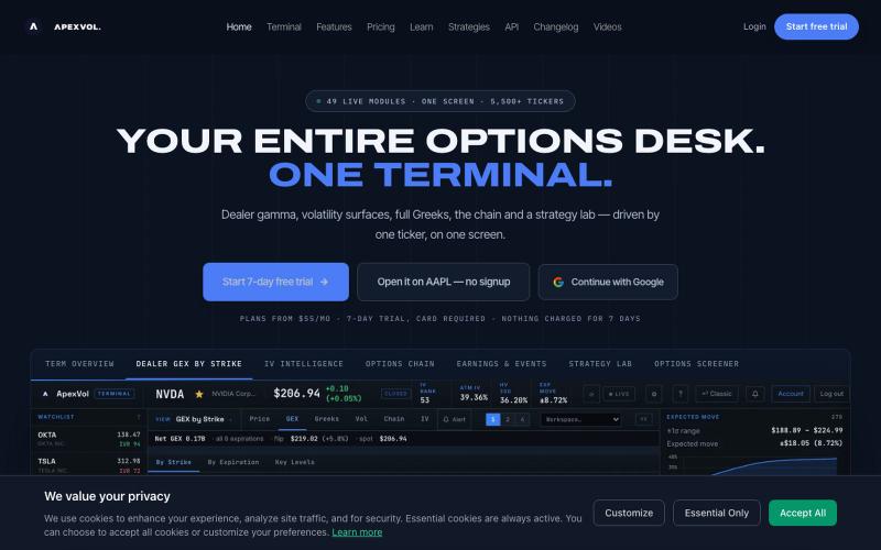
实时期权交易终端,显示6000多只股票的波动率、希腊字母和伽玛敞口。

@apexvol · X
Options are a volatility bet, but price charts can't show you the vol. Our terminal puts the whole surface on one screen: IV rank and percentile, term structure, skew, vol risk premium, dealer gamma and implied earnings moves, across ~6,000 tickers