
实用工具1 month ago
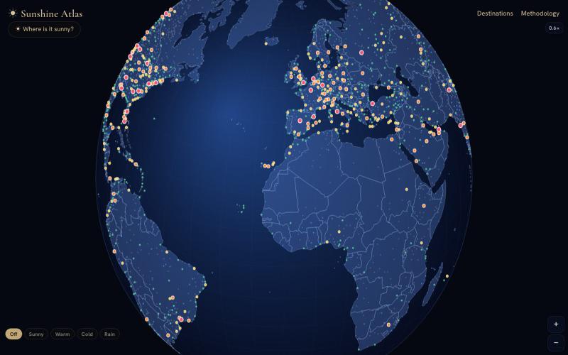
Sunshine Atlas — interactive map of the world's sunshine, warmth & rain
Sunshine Atlas:转动地球发现全球最晴朗、最温暖或降雨最多的地点。

@Flightmussy · X
完整作品展
技术栈
23 projects
Sunshine Atlas:转动地球发现全球最晴朗、最温暖或降雨最多的地点。
@Flightmussy · X

在交互世界地图上浏览150条火车路线及其事实。
@Flightmussy · X
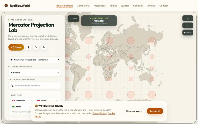
在交互地图上添加国家,查看Mercator投影如何扭曲它们的形状。

@DamianGuzierowi · X
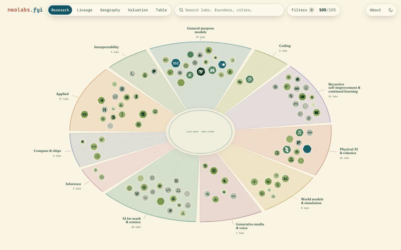
AI实验室交互式地图,按估值、地域和研究方向可视化展示。
polyphilz · HN
Neolabs.fyi – 100 new AI labs by research area, valuation, and more
在Globenomics的3D地球上探索各国经济,玩地理游戏。
u/Pecherskymikel11 · Reddit
I built an explorable 3D globe of the world economy – click any country, get its economy, or play 18 geography games. 10 weeks, zero runtime API calls globenomics.world — spin a 3D globe, click any country, and get its actual economy: GDP, wages, inflation, its biggest companies, and exactly where it ranks against every other country on 34 metrics. Then there are 18 geography games built on the same data — including one where you name as many countries as you can in three minutes, and one

Claim countries and continents on the world's interactive digital map. Buy territory, get outbid, and build your global empire.

@xreadon · X
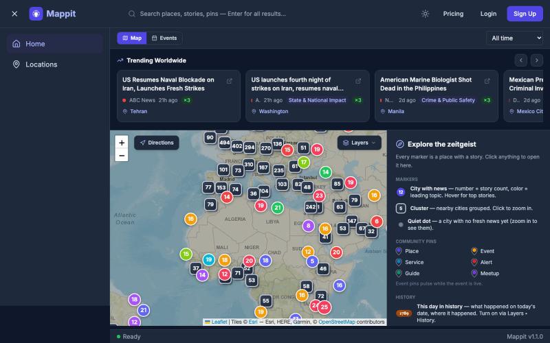
浏览Mappit互动地图,发现AI智能体标注的全球趋势故事

@matthew_meadows · X
Introducing Earth's daily zeitgeist, on a map. Trending, corroborated stories that scope to your view. S&P 500 & Today in History. Drop pins, subscribe to locations & follow users. Chat with Marco! Every place has a story...
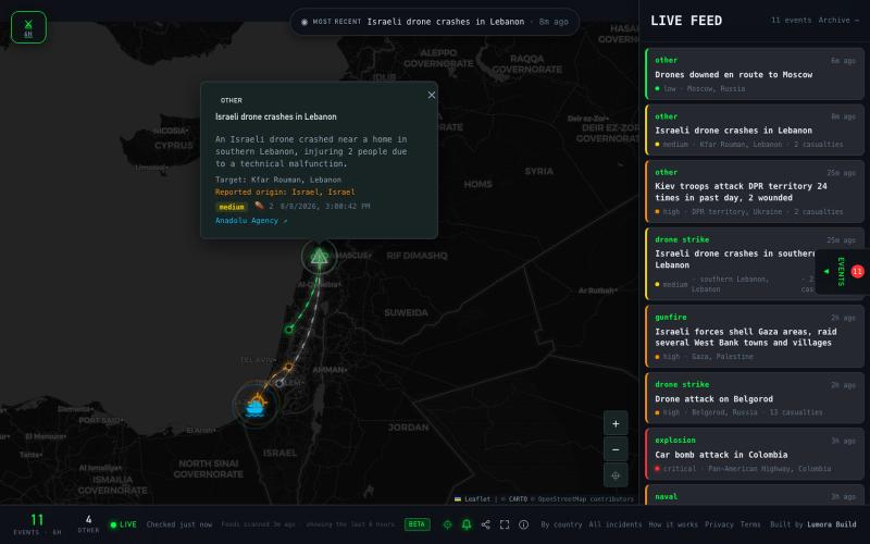
WarMap Live 实时追踪全球无人机轰炸、导弹攻击和炮火事件,数据来自 32 个新闻源。

@lumorabuild · X
Too many news site and page so we just built this managing by ai agent to get us latest war related but with amazing UI
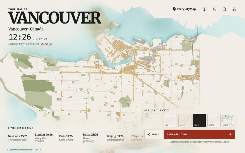
从500个精选城市创建自定义地图,然后下载或分享。

@Az1992Albert · X
I haven’t posted here in a while. I spent the last two weeks vibe coding EveryCityMap from scratch—a small product for styling, sharing and exporting maps of 500 cities. No signup needed. It’s still rough in places, so honest feedback is welcome:
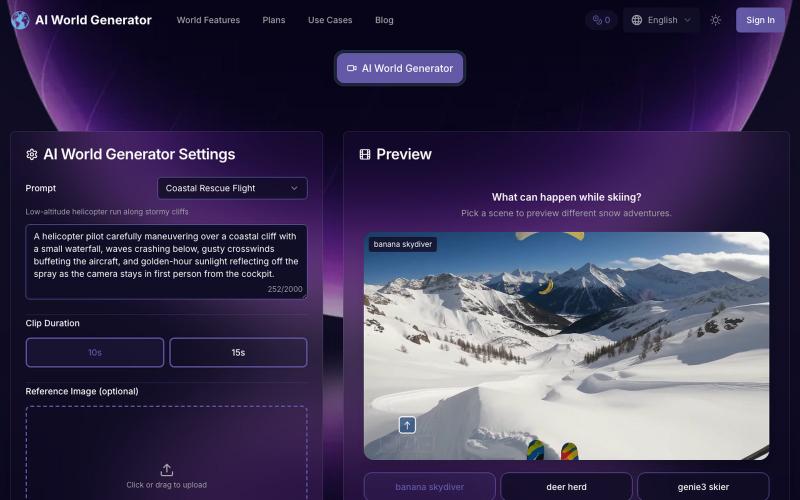
用AI World Generator从文本和照片实时生成互动3D世界,用于游戏、研究和机器人。
ai world generator — 用文本和照片生成自然风光视频的 AI 工具网站
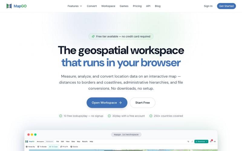
用GIS制图工具分析地理空间数据、计算距离并批量处理CSV文件。

@JanasSebastian · X
