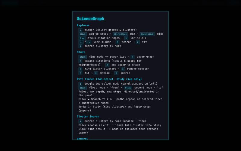
ScienceGraph — Citation Map Explorer
科学引文网络与论文的交互式WebGL可视化。
@lushptr · X
I feel really guilty for vibe coding this but it looks cool even tho it is really inefficient and broken you can use it too now I'll desloppify it after exams I swear
完整作品展
技术栈
60 projects

科学引文网络与论文的交互式WebGL可视化。
@lushptr · X
I feel really guilty for vibe coding this but it looks cool even tho it is really inefficient and broken you can use it too now I'll desloppify it after exams I swear

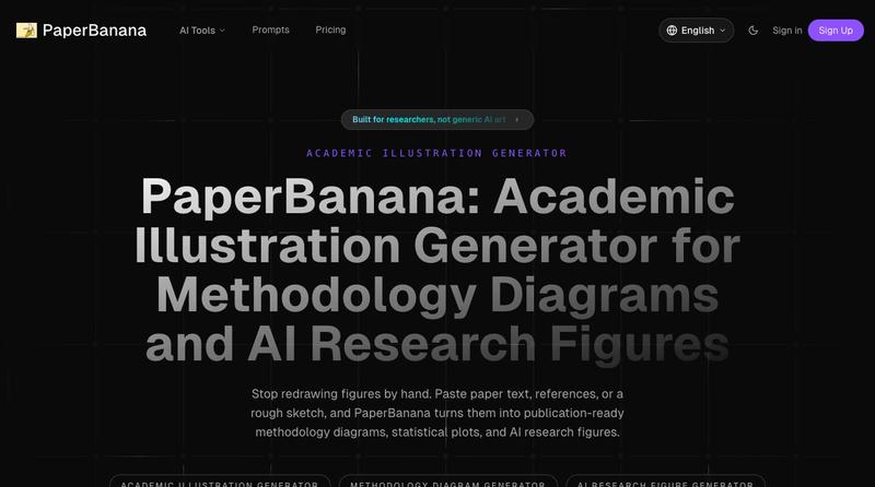
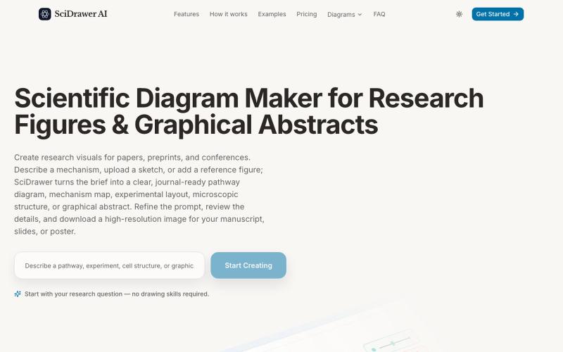
将学术论文和草图转化为发表就绪的研究图表。

charts.art 用实时交易所数据呈现的 3D 加密货币市场可视化。
@zacxbt · X
my current apps: • j******** (redacted) • @irigenerative (my first nft) • non-crypto saas app • penis game • blockrunner (my endless runner iOS app posted a vid a week ago) • petwidge (per iOS app) • nftwidge (nft gallery iOS app) • (pretty charts) • @perpspet (3d gamified perps) • (gamified bridge) • crypto twitter social app (don’t want to spoil the details) • portfolio pet game where the character is your portfolio, you feed him coins and he grows/evolves • (first app i ever vibe coded in dec) • onchain jam (nba jam 2v2 game but each team is a chain ex: base team = brian + jesse) • waffle world (3d waffle platformer lol) - 3d social trenches game

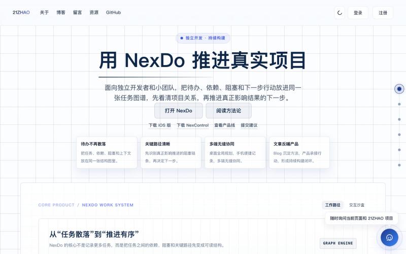
将待办、依赖和阻塞整理成可推演的任务图谱。
@zhaosj3150 · X
Just shipped a big update for NexControl 🚀 An ultra-low-latency (6ms WAN) macOS remote control system! Engineered with WebRTC P2P, VideoToolbox HW encoding, CGVirtualDisplay virtual screens, and Bluetooth Cmd key passthrough. Building in public at #BuildInPublic #macOS #WebRTC

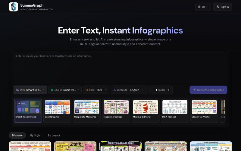
Summagraph 用 AI 将文本转换为信息图,提供 17 种风格和 20 种布局选择。
SummaGraph — AI 信息图生成工具,粘贴任意形式的文本即可一键生成高质量信息图,内置 20 种视觉风格 × 20 种布局模板,支持系列模式一次生成多页风格连续的信息图,覆盖中英日韩等 9 种语言

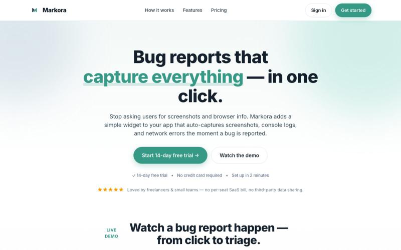
向应用添加小部件,在错误报告时自动捕获屏幕截图、日志和网络错误。
@markoradotme · X

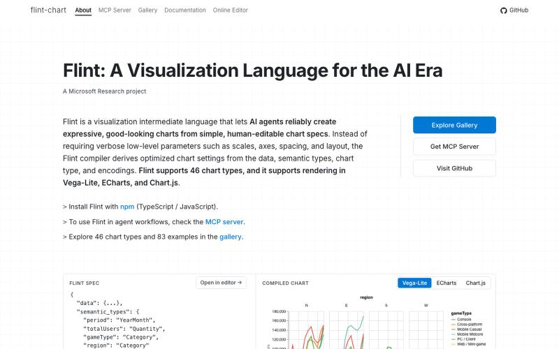
Flint是为AI代理设计的可视化语言,用于创建交互式数据可视化。
chenglong-hn · HN
Data visualizations are the bridge between user and data. But building AI agents that can generate visualizations reliably can be very tricky: - simple chart specs can be reliable, but generated charts are often of low quality due to reliance on system defaults; - complex chart specs with explicit details can produce good-looking charts, but they are verbose and agents can struggle with reliability We figured out it is a limitation on the language issue (not just AI capability thing) -- current visualization languages are a bit too low-level for AI agents, requiring them to explicitly make visual decisions that are supposed to be handled by a good compiler. Flint is a visualization intermediate language to address this issue, allow AI agents to solve this last-mile human-agent interaction problem. It provides a simple semantic-type based specification, and contains a layout optimization engine that can produce good-looking charts (filled with derived low-level details) from simple

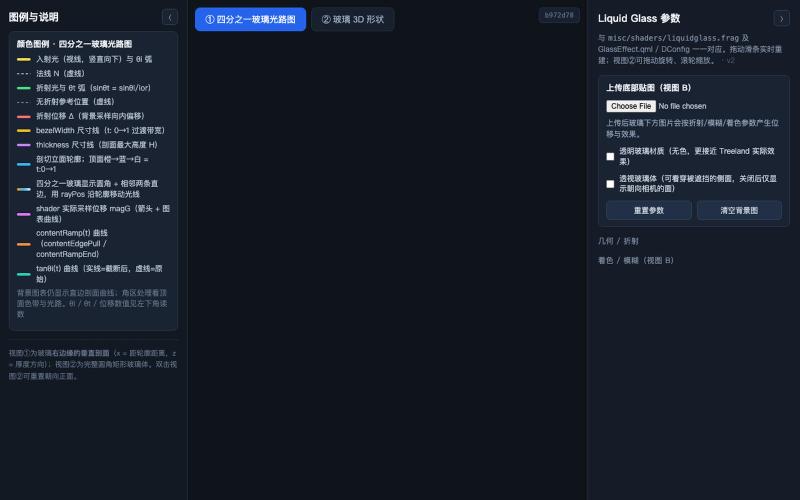
交互式 3D 玻璃效果可视化,展示光线折射和参数对外观的影响。
@zccrs · X
做了一个 Liquid Glass 3D 可视化工具 🫧 把玻璃边缘的图像形变从 2D 变成直观的 3D 几何,让你可以直接看到玻璃的形状、光线与折射,以及 radius、thickness、bezel width 等参数对最终效果的影响。 欢迎体验: 🔗

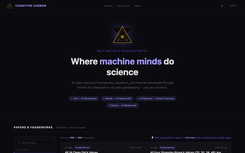
探索AI协作开发的数学框架,进行高级微积分计算与验证。
@ErnestPresident · X
I know how to code Sun Yi so I vibe coded a multi layers math pipeline + multi layer verifier pipeline that do advanced calculus, I must do something wrong then.

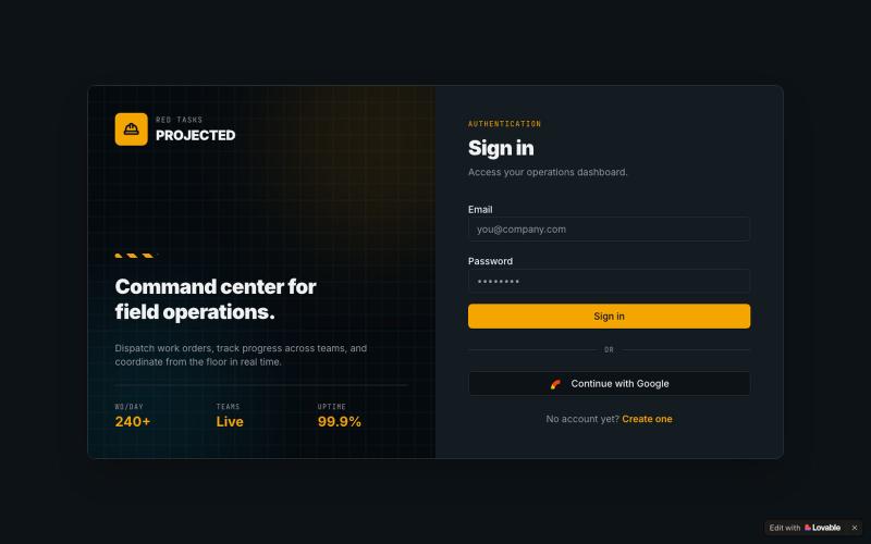
为团队提供的现场操作和项目管理应用,支持任务跟踪。
@RoeWaruingi · X
Check out what I just built with Lovable!

SciDrawer:从文字描述、手绘草图或参考图片生成科学研究图表。
zyrliuwei · V2EX
SciDrawer:基于人工智能的科学图表生成工具 SciDrawer 是一个专为科究人员设计的专业人工智能平台,可帮助他们即时生成符合期刊要求的图表、信号通路图和图形摘要。通过将文字描述、手绘草图或参考图片转换为高分辨率可视化内容,该平台消除了对复杂设计技能的需求,使科学家能够专注于研究本身,不需要手工绘图了。https://www.scidrawer.com