
健康3 weeks ago
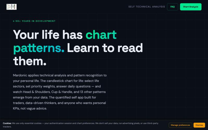
mardonic — Candlestick Chart for Life | Self Technical Analysis & Pattern Recogn
将股票图表模式分析应用于个人生活数据。

@RingletsofLogan · X
完整作品展
技术栈
60 projects
将股票图表模式分析应用于个人生活数据。
@RingletsofLogan · X
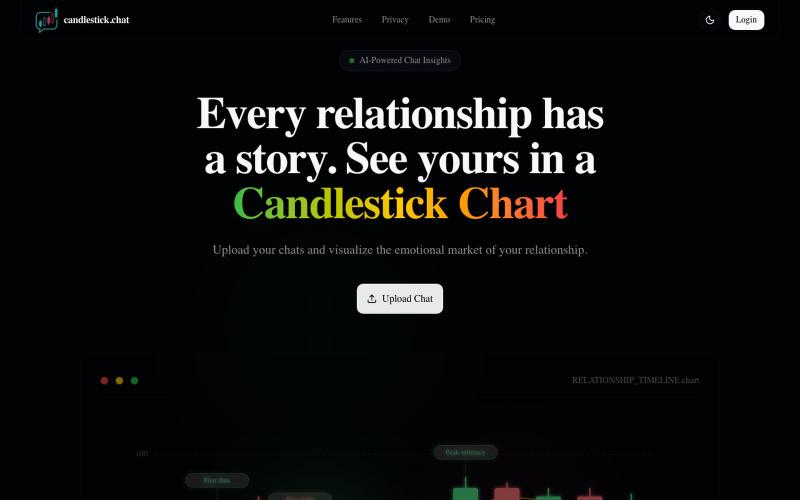
上传聊天记录,以烛台图表形式可视化你的关系情感趋势。

@Henry_Yangs · X
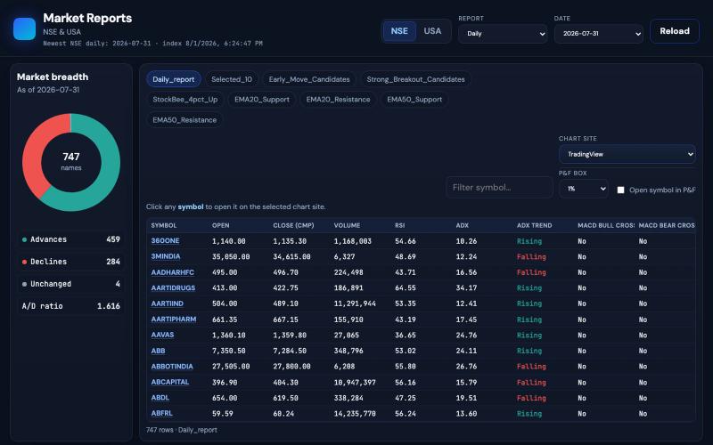
@jacobAlswin Point and figure chart US stock https://t.co/LiS8OfbhKj

@neha041187 · X
Point and figure chart US stock
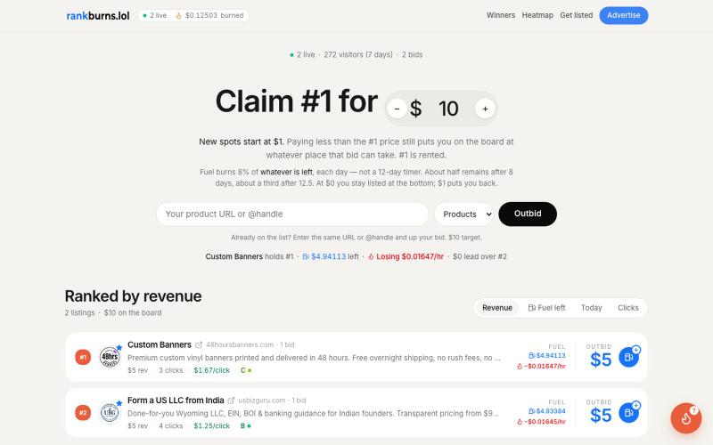
Live pay-to-rank board. Custom Banners holds #1. 2 listings, 271 unique visitors in 7 days. Fuel burns 8%/day. Paid placement.

@rankburns · X
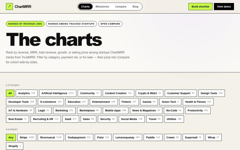
按类别和30天表现浏览已验证的收入图表。

@gimafore · X
Market intelligence on verified revenue, see how much it takes to get ROI when you acquire a startup
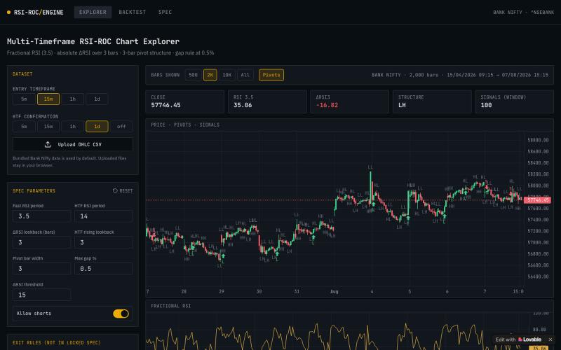
交互式图表工具,用技术指标分析Bank Nifty指数,支持多个时间框架。

@bariyaone · X
Check out what I just built with Lovable!
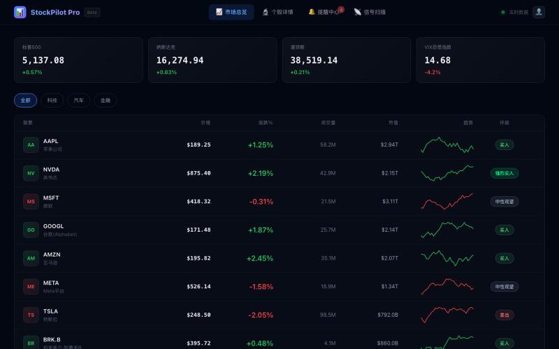
美股交易信号平台,分析市场数据识别交易机会。

@MEJ50749 · X
用 @dappOS_com coding 做了一个美股信号网站: 它和普通美股行情网站最大的区别是:普通网站更多是“给你看行情”,而这个网站更像一个“辅助交易工作台”。 大多数美股网站会把价格、涨跌幅、新闻、财报、K 线分散展示出来,信息很多,但用户还要自己判断: 哪只股票值得看? 现在是什么信号? 这个信号强不强? 有没有触发提醒? 后续要不要复盘? 我这个站的核心思路不是堆信息,而是把交易前的观察流程做成工具: 1. 市场总览不是单纯看涨跌 首页会把美股标的放进观察池里,比如 AAPL、NVDA、MSFT、GOOGL、AMZN、META、TSLA 等,不只是显示价格,还会结合涨跌幅、成交量、市值、PE/PB、行业、52 周区间等信息,让我先快速判断哪些票值得继续看。 2. 最重要的是信号扫描器 这个功能是普通行情站很少直接做成工作流的地方。 网站里有“智能信号扫描器”,可以扫描技术形态,并把信号归类成突破、反转、动量、超卖、超买、金叉、死叉、背离等类型。 比如: NVDA 出现强势突破、量能放大、均线多头排列; AAPL 出现 MACD 金叉、RSI 超卖反弹、布林带下轨支撑; MSFT 出现 MACD 背离,需要注意短期回调; TSLA 出现均线死叉,提示中期下行压力。 这就不是简单告诉我“今天涨了多少”,而是帮我回答一个更交易化的问题: 这只股票现在为什么值得关注,关注点在哪里? 3. 个股详情页更像交易前检查清单 普通网站的个股页往往是行情 + 新闻 + 财务数据。 我这个站的个股详情页更偏“交易前判断”:价格、评级、52 周区间、K 线/成交量、基本面、技术信号、资讯都放在一起。 它的价值是把“发现信号”之后的下一步接住。 扫描器告诉我哪只票有异动,详情页帮我进一步看这个信号有没有质量。 4. 提醒中心是我最喜欢的功能 这个站不是看完就结束,而是有 Alerts Center。 里面可以看到全部提醒、已触发提醒、等待中提醒,还能新建价格/信号提醒。 比如: NVDA 突破 900 美元触发提醒; AAPL 出现 MACD 金叉提醒; TSLA 等待成交量异常触发; META 跌破支撑提醒止损风险; AMZN 突破近期高点提醒动能增强。 这和普通美股网站最大的差异就在这里: 它不只是信息展示,而是把“观察 →
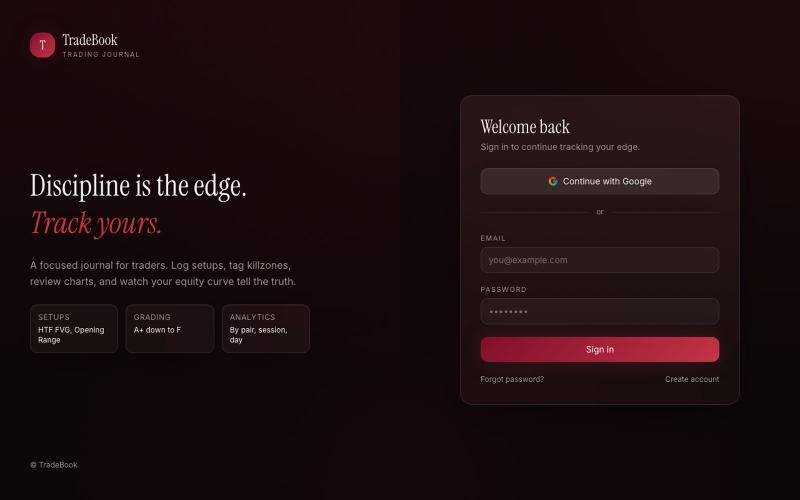
记录交易、追踪权益曲线和性能的交易日志应用。

@NimraWeb3 · X
So I vibe coded my own with Lovable TradeBook. Log trades w/ session, killzone, model, grade, R:R + screenshots, track multiple accounts, get a real dashboard (equity curve, win streaks, pair/session breakdowns). Demo: GitHub:

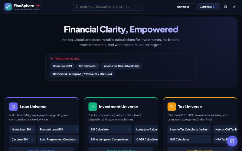
FinoSphere Pro - 财务计算平台,支持房贷、税收、基金、交易和退休规划。

@sarkar68154 · X
Just launched FinoSphere Pro and the feedback on Product Hunt is 🔥 [ Free all-in-one finance calculator 👇 #buildinpublic #finance
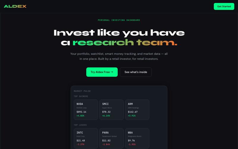
Aldex — personal investing dashboard for portfolio tracking, watchlists, and trade journaling.

@aldexapp · X
- personal investment dashboard with research mechanics and a customizable framework
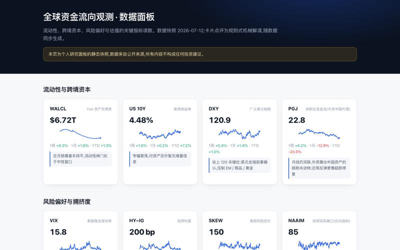
通过实时财务指标监控全球资金流向和市场情绪。

@Evelyn_tree1 · X
I built a dashboard that just shows me where global money is flowing. Free public data, rebuilds itself twice a day. Every indicator answers exactly one question. Is money loose or tight? Flowing where? Buying what? Risk-on or risk-off? Crowded? If it doesn’t answer one of these, it doesn’t get a slot on the board. Reading got the same treatment: a hard cap of 45 min/day → 5 RSS feeds + 5 newsletters, each rate-limited (Damodaran: about one post a month). I’d rather miss a few things than let the feed become an anxiety machine. I don’t write code. Claude Code wrote every script — fetch, build, publish, twice a day on cron. I set the rules and keep the judgment; the machine does the running. Personal research notes, not investment advice.
