
社交社区1 month ago
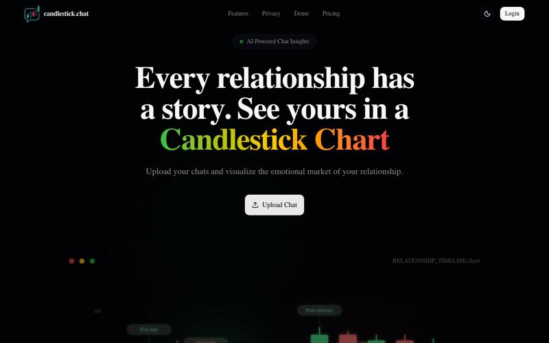
Relationship Candlestick | Visualize Your Emotional Market
上传聊天记录,以烛台图表形式可视化你的关系情感趋势。

@Henry_Yangs · X
完整作品展
技术栈
60 projects
上传聊天记录,以烛台图表形式可视化你的关系情感趋势。
@Henry_Yangs · X
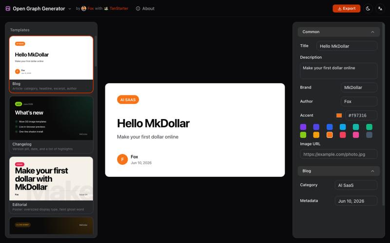
从模板生成可定制的 Open Graph 图片,用于博客和社交媒体。
javayhux · V2EX
名称:Open Graph 图片生成器 网址:[https://og.mkdollar.com]( https://og.mkdollar.com) 功能:内置 10+ Open Graph 图片模板,选择模板,配置参数,即可生成好看的 OG 图片,适用于文章配图、社媒帖 子封面等场景 价格:免费使用,免费下载 
Ask anything. Get answers from your chart.

@dadaroo247 · X
Check out what I just built with Lovable!
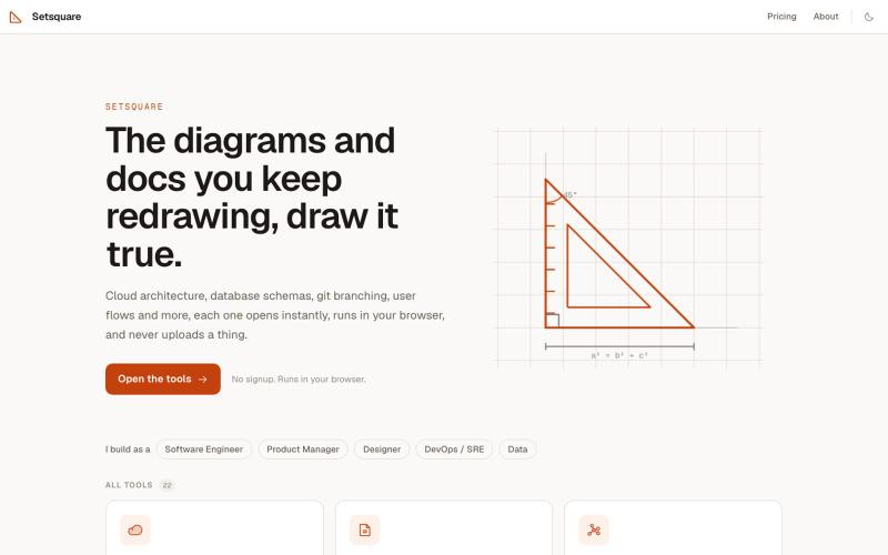
为工程师设计的 22 个浏览器图表工具:云架构、数据库、API 流程、状态机等。
u/Sapo-Homien · Reddit
I build iLovePDF - but for Software Engineering. No Sign-up, No ads, No limits, Nothing leaves your browser. 22 browser tools for the stuff engineers keep redrawing: cloud architecture diagrams, ER diagrams, git branching, user flows, state machines, sequence & API diagrams, annotated screenshots, and an AI-prompt builder. No signup, no ads, no limits. Everything you need, runs in your browser. Open your browser's Network tab and watch a tool do its work without a single req
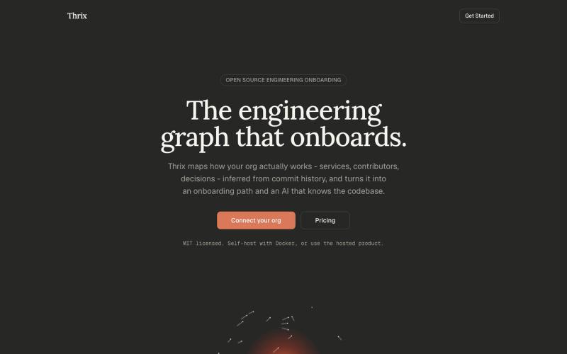
Open-source engineering onboarding built around a living graph of how your org actually works - services, contributors, and decisions inferred from commit history, surfaced as an o

@Syncyeep · X
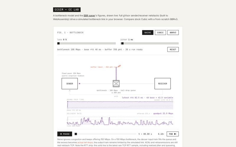
在浏览器中用 WebAssembly 模拟和可视化 BBRv3 拥塞控制算法。
dilyevsky · HN
BBRv3 for gVisor's netstack, visualized in the browser using WASM
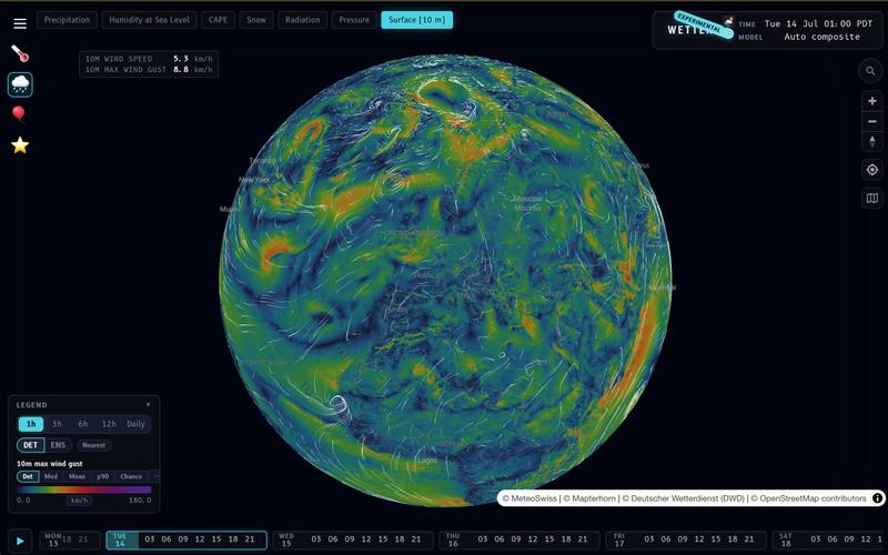
Wetter 支持本地计算和自定义聚合模式的天气预报和可视化应用。
__mp · HN
I built my own weather prediction / visualization app: https://wx.rsp.li (on-device temperature lapsing, on device interpolation modes, user-selectable aggregations, etc…). One of these days I should do a writeup. I also asked Claude to build a photo gallery for me https://places.pascalspoerri.ch (HDR, map support, similar images)

LSBattle实时展示BTC/ETH/SOL期货市场多空战场可视化。
flreey · V2EX
模拟 btc/eth/sol 多空军沙盘效果 https://w3arb.xyz/ 其他地方看到的创意,我觉得很有意思,模拟币圈多军/空军对战场景 底部还可以发弹幕,聊天
@Joi2James https://t.co/EX6jR2itEt https://t.co/sXaN7QuPuY

@SamEkeNnamdi · X
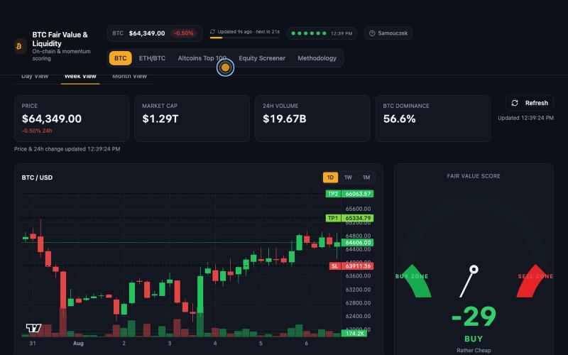
在暗色仪表板中查看 Bitcoin 公平价值、ETH/BTC 强度和山寨币动量。

@Senioo · X
Check out what I just built with Lovable!
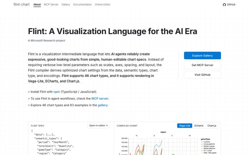
Flint是为AI代理设计的可视化语言,用于创建交互式数据可视化。
chenglong-hn · HN
Data visualizations are the bridge between user and data. But building AI agents that can generate visualizations reliably can be very tricky: - simple chart specs can be reliable, but generated charts are often of low quality due to reliance on system defaults; - complex chart specs with explicit details can produce good-looking charts, but they are verbose and agents can struggle with reliability We figured out it is a limitation on the language issue (not just AI capability thing) -- current visualization languages are a bit too low-level for AI agents, requiring them to explicitly make visual decisions that are supposed to be handled by a good compiler. Flint is a visualization intermediate language to address this issue, allow AI agents to solve this last-mile human-agent interaction problem. It provides a simple semantic-type based specification, and contains a layout optimization engine that can produce good-looking charts (filled with derived low-level details) from simple
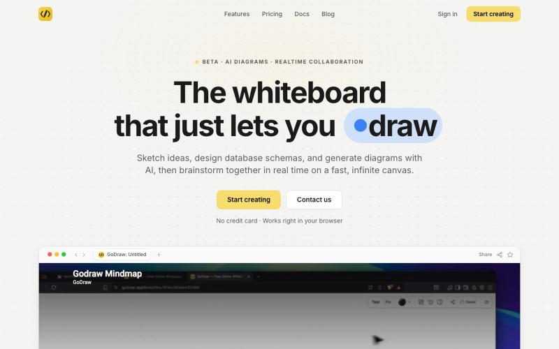
GoDraw: 在线白板和图表工具,支持即时协作,无需注册。

@rishabh21g · X
The whiteboard that just lets you draw