
创意工具2 weeks ago
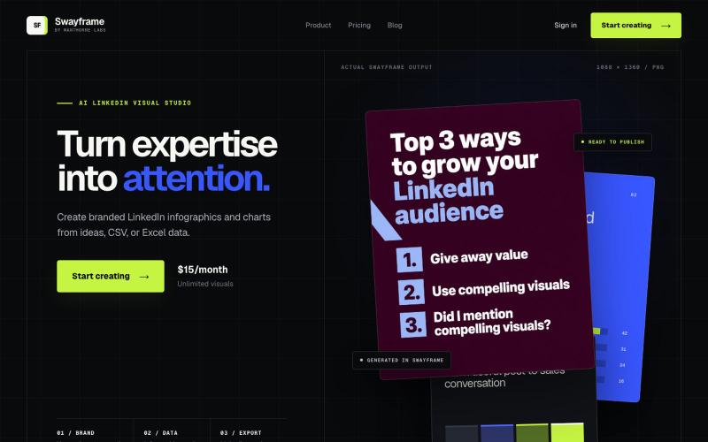
Swayframe — AI LinkedIn Infographic & Chart Maker
从想法、CSV或Excel数据生成LinkedIn信息图和图表。

@manthornelabs · X
We make LinkedIn graphics for B2B founders
完整作品展
技术栈
60 projects
从想法、CSV或Excel数据生成LinkedIn信息图和图表。
@manthornelabs · X
We make LinkedIn graphics for B2B founders
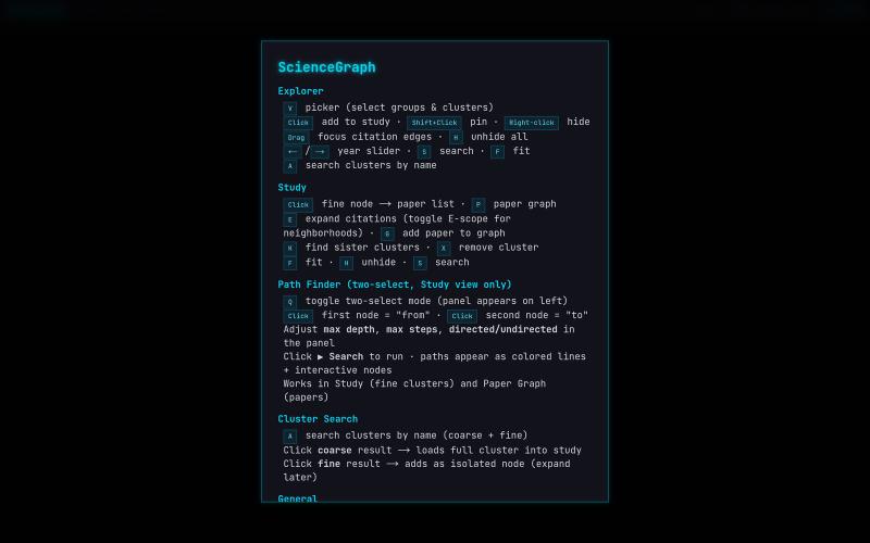
科学引文网络与论文的交互式WebGL可视化。

@lushptr · X
I feel really guilty for vibe coding this but it looks cool even tho it is really inefficient and broken you can use it too now I'll desloppify it after exams I swear
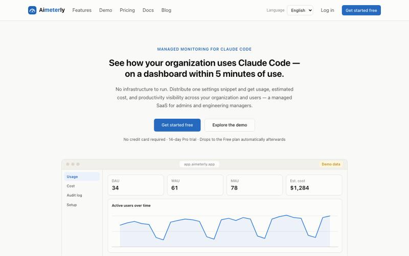
通过每用户仪表板跟踪 Claude Code 的使用情况、成本和团队生产力。
ninomae · HN
Aimeterly – Per-user cost dashboards from Claude Code's built-in OTel
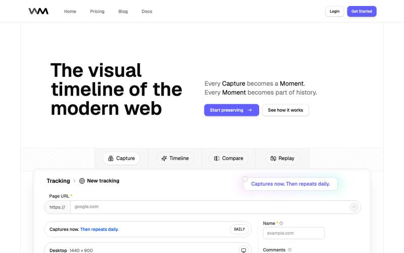
WebMoment - 记录并回放网站在任何时刻的外观。

@WebMomentApp · X
Dropping here, for saving how websites looked before the next redesign changes everything: @WebMomentApp

上传图像并将其转换为 SVG 矢量文件,用于切割绘图机。

@PlotterAI01 · X
Check out what I just built with Lovable!
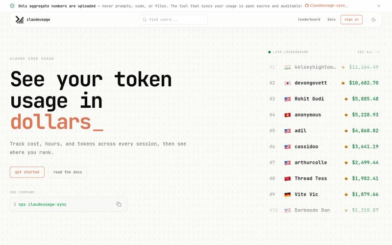
追踪您的 Claude Code 使用情况和成本,查看排行榜排名。
u/turing1337 · Reddit
I made a sleek Claude Code Usage Leaderboard I wanted to make a modern easy to sync web dashboard for my claude code usage. I use it everyday myself to track my usage and see in in dollars. It also has a public leaderboard so you can see how much other people spend and what Antrophic models they use. Safety and Privacy first, the npm package you run only reads numbers and never your prompts, chat messages. The code for the sync package is open sourced. please check it ou
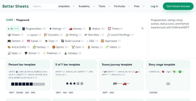
浏览并复制2054+个Google Sheets公式,用于进度条、星级评分和视觉效果。

@Kamphey · X
I made a database of 2,000 google sheets formulas that bring JOY to sheets. includes Star Wars, Lord of the Rings progress bars, and timers, and compasses too.
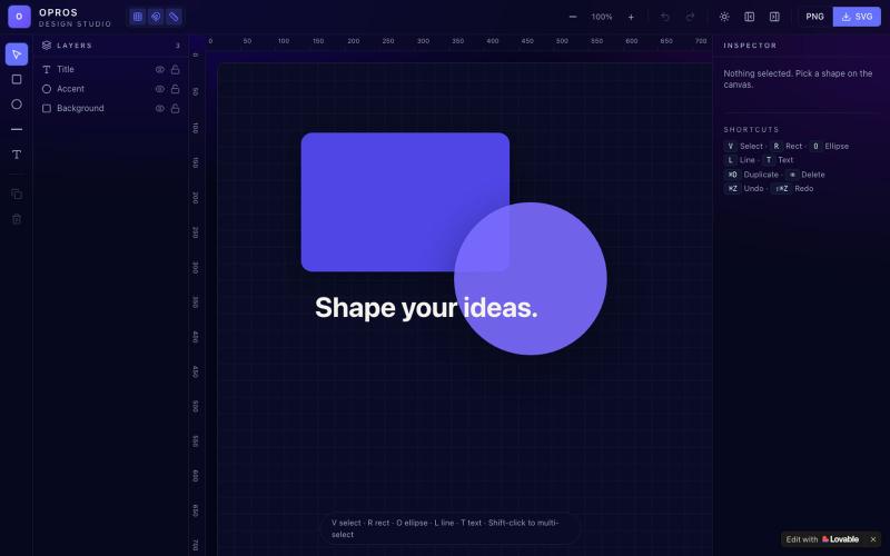
在网络上创建和可视化设计的创意工作室OPROS Design Studio。

@OprosOlamiflex · X
Check out what I just built with Lovable!
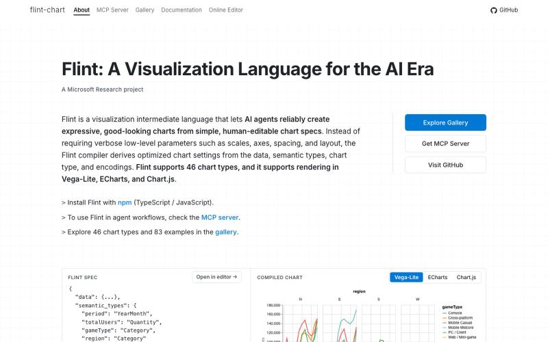
Flint是为AI代理设计的可视化语言,用于创建交互式数据可视化。
chenglong-hn · HN
Data visualizations are the bridge between user and data. But building AI agents that can generate visualizations reliably can be very tricky: - simple chart specs can be reliable, but generated charts are often of low quality due to reliance on system defaults; - complex chart specs with explicit details can produce good-looking charts, but they are verbose and agents can struggle with reliability We figured out it is a limitation on the language issue (not just AI capability thing) -- current visualization languages are a bit too low-level for AI agents, requiring them to explicitly make visual decisions that are supposed to be handled by a good compiler. Flint is a visualization intermediate language to address this issue, allow AI agents to solve this last-mile human-agent interaction problem. It provides a simple semantic-type based specification, and contains a layout optimization engine that can produce good-looking charts (filled with derived low-level details) from simple

LSBattle实时展示BTC/ETH/SOL期货市场多空战场可视化。
flreey · V2EX
模拟 btc/eth/sol 多空军沙盘效果 https://w3arb.xyz/ 其他地方看到的创意,我觉得很有意思,模拟币圈多军/空军对战场景 底部还可以发弹幕,聊天